Comprehensive Heuristic Evaluation Report Templates: A Guide to Usability Success
In the realm of web development, usability reigns supreme. Ensuring that users navigate your website with ease and satisfaction is paramount. Heuristic evaluation, a powerful tool in the arsenal of website usability testing, offers invaluable insights into potential usability issues. With our comprehensive guide and ready-to-use templates, you’ll empower your team to conduct effective heuristic evaluations, paving the way for a seamless user experience.
Our templates are meticulously designed to streamline the evaluation process, enabling you to identify and address usability issues with precision. We’ll delve into the intricacies of heuristic evaluation, guiding you through every step, from understanding its principles to crafting actionable recommendations. By embracing our templates and best practices, you’ll unlock the full potential of heuristic evaluations, ensuring that your website stands out as a beacon of user-friendliness.
Heuristic Evaluation Overview
Heuristic evaluation is a usability inspection method where experts evaluate a website’s user interface (UI) against a set of recognised usability principles, called heuristics. This method helps identify usability issues that may not be apparent during user testing. By identifying these issues early on, businesses can improve the overall user experience and increase website effectiveness.
Heuristic evaluation is particularly useful when time and resources are limited, as it can be conducted quickly and efficiently by a small team of experts. It is also a valuable tool for evaluating websites that are still under development, as it can help identify potential usability problems before they become major issues.
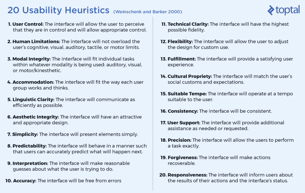
Common Heuristics
There are many different sets of heuristics that can be used for heuristic evaluation. Some of the most common include:
- Nielsen’s 10 heuristics: These heuristics were developed by Jakob Nielsen and are widely used in the field of usability engineering. They include principles such as visibility of system status, match between system and the real world, and user control and freedom.
- Shneiderman’s 8 golden rules of interface design: These rules were developed by Ben Shneiderman and focus on the principles of consistency, feedback, user control, and simplicity.
- The ISO 9241-110 standard: This standard provides a set of ergonomic requirements for the design of interactive systems. It includes heuristics related to user-friendliness, efficiency, and error prevention.
Template Structure
Yo, blud, check this out! We’ve got a sick template for you to use when you’re evaluating the usability of a website or app. It’s like a blueprint for spotting any dodgy bits and making sure your users have a right old time.
The template is an HTML table, fam. It’s got columns for all the important stuff, like:
- Usability issues: This is where you’ll list all the problems you find, like broken links or confusing navigation.
- Severity ratings: This is where you’ll rate how bad each issue is, from minor to major.
- Recommendations: This is where you’ll suggest ways to fix the issues.
- Supporting evidence: This is where you’ll provide any screenshots or other evidence to back up your findings.
To use the template, just fill in the columns with your info. You can add as many rows as you need, and you can even sort the table by severity rating to see which issues need to be fixed first.
Issue Identification and Severity Rating
When it comes to sussing out usability issues during your evaluations, there’s a bunch of common nasties to keep your eyes peeled for. We’re talking things like buttons that don’t work, links that lead to nowhere, and text that’s as clear as mud. These issues can make it a right pain for users to get what they want from your website or app, so it’s crucial to spot ’em and deal with ’em sharpish.
Once you’ve got your list of issues, it’s time to rate ’em based on how bad they are. We use a severity rating system that goes from minor to critical. Minor issues are like a little paper cut – annoying, but not the end of the world. Major issues are more like a stubbed toe – painful, but you can still hobble around. Critical issues are like a broken leg – they can stop users from using your website or app altogether.
To assign a severity rating, think about how much the issue affects the user’s experience. If it’s just a minor inconvenience, it’s probably a minor issue. If it makes it difficult for users to complete their tasks, it’s likely a major issue. And if it makes your website or app unusable, well, that’s a critical issue.
Recommendation Development

Recommendations are the lifeblood of any heuristic evaluation report. They’re what turn your findings into actionable steps that can improve the user experience. That’s why it’s so important to make sure your recommendations are clear, actionable, and prioritized.
A clear recommendation is one that leaves no room for interpretation. It should be specific, measurable, achievable, relevant, and time-bound (SMART). For example, instead of saying “Improve the website’s navigation,” you could say “Add a search bar to the top of the homepage.”
An actionable recommendation is one that can be implemented without a lot of extra work. It should be something that the development team can do with the resources they have. For example, instead of saying “Redesign the website’s layout,” you could say “Move the call to action button to the top of the page.”
A prioritized recommendation is one that is more important than others. This is where you use your judgment to decide which recommendations will have the biggest impact on the user experience. For example, you might prioritize a recommendation to fix a critical usability issue over a recommendation to improve the website’s aesthetics.
By following these best practices, you can write recommendations that will help your team improve the user experience and make your website a success.
Prioritizing Recommendations
There are a few different ways to prioritize recommendations. One common method is to use a severity rating system. This system assigns each recommendation a severity level, such as low, medium, or high. High-severity recommendations are the most important and should be addressed first.
Another method of prioritizing recommendations is to use a cost-benefit analysis. This method takes into account the cost of implementing a recommendation and the benefits that it will provide. Recommendations with a high cost-benefit ratio should be prioritized over recommendations with a low cost-benefit ratio.
Finally, you can also prioritize recommendations based on your own judgment. This is a good option if you have a deep understanding of the user experience and the website’s goals.
Supporting Evidence

Supporting evidence plays a crucial role in heuristic evaluations. It strengthens the findings and recommendations by providing concrete proof of usability issues.
To collect supporting evidence, consider using:
– Screenshots: Capture images of the user interface to illustrate specific issues.
– User quotes: Include verbatim quotes from users to demonstrate their experiences and frustrations.
– Data analysis: Analyze user behavior data (e.g., click rates, error rates) to identify areas for improvement.
When presenting supporting evidence in the report, be selective and include only the most relevant and compelling examples. Organize the evidence logically, and clearly explain its significance.
Example Heuristic Evaluation Reports
Bruv, let’s check out some sick heuristic evaluation reports that’ll make your website lit.
Well-Structured Reports
Yo, these reports are on point. They’re organized, clear, and easy to navigate. They start with a bangin’ intro that gives you the lowdown on the evaluation, and then they dive into the details. The issues are listed in a logical order, and each one is backed up with solid evidence.
Informative Reports
Fam, these reports are chock-full of info. They don’t just list the issues; they explain why they’re important and how they affect the user experience. They also provide practical recommendations for fixing the problems.
Strengths and Weaknesses
Innit, every report has its ups and downs. Some reports are strong on structure but weak on detail, while others are packed with info but hard to follow. The key is to find a report that strikes the right balance between these two elements.
Adapting Templates
Blud, you can totally adapt these templates to fit your specific website evaluation. Just remember to keep the core elements the same: the intro, the issue list, the evidence, and the recommendations. You can tweak the details to match your website’s unique needs.
Best Practices
Yo, here’s some dope best practices for writing heuristic evaluation reports:
* Use clear and concise language.
* Provide plenty of evidence to support your claims.
* Make your recommendations specific and actionable.
* Get feedback from other people before you finalize your report.
FAQ Corner
What are the key benefits of using heuristic evaluation report templates?
Our templates provide a structured framework, ensuring consistency and thoroughness in your evaluations. They streamline the process, saving time and effort while enhancing the accuracy and reliability of your findings.
How can I effectively prioritize the identified usability issues?
Prioritize issues based on their severity and potential impact on user experience. Focus on addressing critical issues that hinder core functionalities or cause significant user frustration.
What types of supporting evidence should I include in my report?
Screenshots, user quotes, data analysis, and references to industry best practices serve as valuable evidence to support your findings and recommendations.